You’ve just launched your startup. The idea is simple: create an online platform where college students all around Switzerland can connect, share ideas, and build communities. Early on, everything looks promising users are joining, discussions are active, and growth feels organic.
Then things start to break down.
Some communities thrive, while others spiral into conflict. Users jump between groups, arguments spill across community boundaries, and moderation becomes harder than expected. What started as a space for connection slowly reveals a more complex and fragile ecosystem.
This problem isn’t unique, platforms like Reddit, X, and Facebook, despite being rich sources of information and community interaction, all ended up with pockets of extreme hostility, community clashes, and drama.
Before you repeat their mistakes and your platform completely collapses into a combination of 4chan and liveleak, you need to understand:
-
When conflict between communities arises?
-
Which types of conflict are constructive vs harmful?
-
Why some interactions devolve into hostility while others don’t?
-
How can we prevent these same pitfalls in our own social media service?
To answer these questions, you dig into crosspost data from Reddit one of the most complex ecosystems of online communities.
0. The reddit dataset
The first, and possibly most important aspect of our study is the data. For this, we’re using the Reddit Hyperlink Network dataset[1] from the Stanford SNAP collection.
It models interactions between Reddit communities at the subreddit level. In this dataset, each node represents a subreddit, and each directed edge corresponds to a post in one subreddit that contains a hyperlink to another subreddit. Edges are timestamped and annotated with a sentiment label indicating whether the reference is neutral/positive or negative toward the target community. Covering Reddit activity from 2014 to 2017, this dataset provides a large-scale, structured view of how communities interact.
Each edge comes with a compact 86-dimensional PROPERTIES vector that summarizes the text. It includes VADER sentiment scores (positive/negative/compound, tuned for social media), LIWC category counts (anger, anxiety, social, work, etc.), and basic structural signals like word count and capitalization. We use these features to compare how different communities express negativity in both tone and style.
In addition, we used one other dataset, the Reddit User and Subreddit Embeddings[2]. This gives us “embeddings” for users and subreddits. In the case of users, these embeddings capture user activity. And in the case of subreddits, these embeddings act as a sort of overview of how the users in each subreddit behaves. While we will not go deep into embeddings, they essentially allow us to compare how similar two users or subreddits are. If two users have similar embeddings, they likely act in similar ways and visit similar subreddits.
1. How hostile are subreddit interactions, really?
We begin with a global picture of tone across posts.
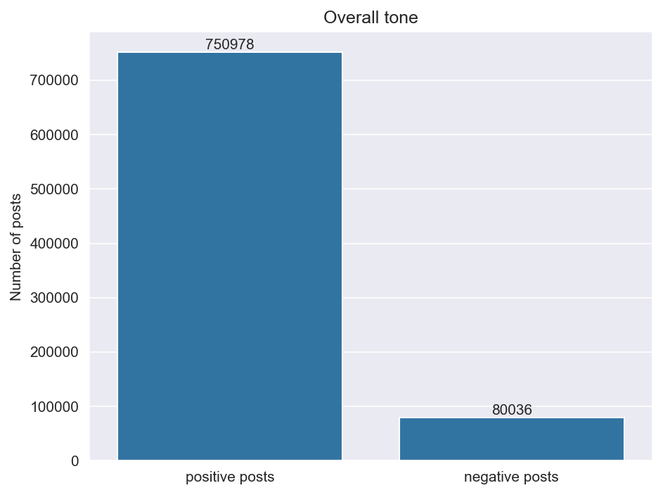
Surprisingly, we notice something that is rather encouraging:
Negativity is the exception, not the norm
The majority of posts are either positive or neutral (90.3%), and only 9.7% are negative.
However, exceptions do matter. Even a relatively small group of negative posts tend to have a large impact on the general atmosphere of social media. Our goal is therefore to better understand this 9.7%.
To do this, we will look at the distribution of the number of negative links per subreddit: we rank the subreddits by how many negative posts they send (from most to least) and we plot this distribution on a log-log scale.
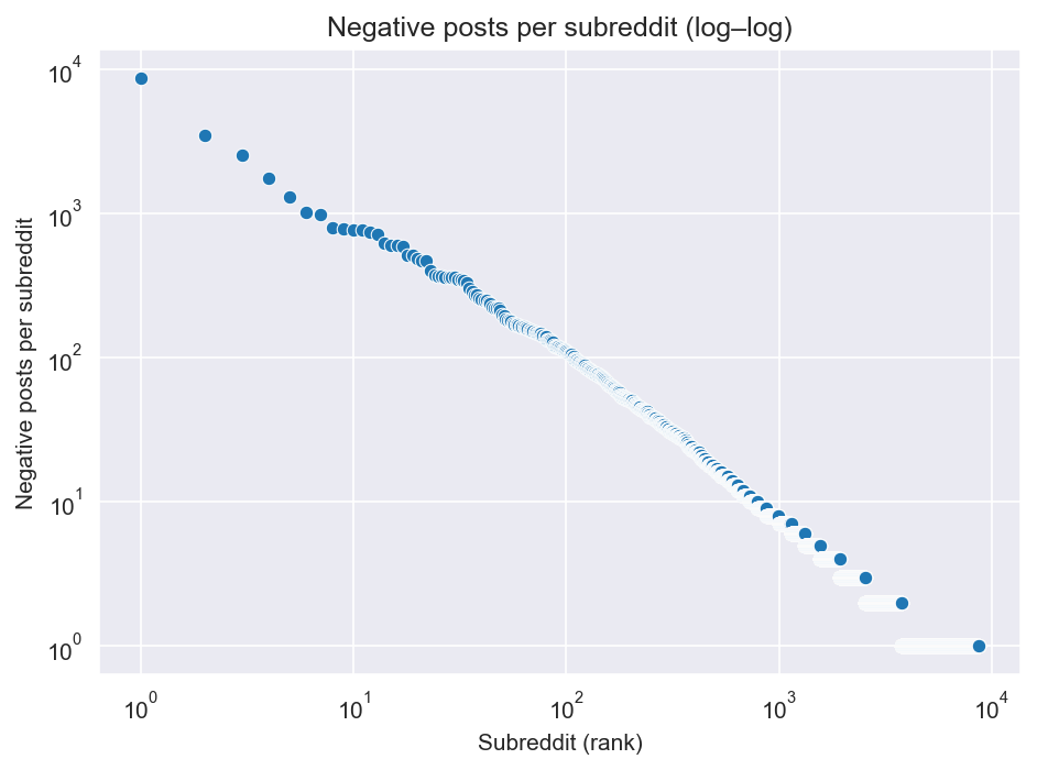
We recognize a well-known distribution: a heavy-tailed distribution. This means that a small portion of subreddits accounts for a very large number of negative posts, while the vast majority produce very few.
For moderation, this is encouraging!
If a small proportion is responsible for most negative interactions, targeted interventions could be extremely effective. Even minimal moderation has the potential to have a strong impact on ensuring that our new app doesn’t fall into the same patterns of toxicity as Reddit.
2. From individual subreddits to communities
We now know that negativity is concentrated in a small number of subreddits.
But working only at the level of individual subreddits becomes quickly complicated. Reddit has tens of thousands of subreddit, and looking at these individual subreddits one by one would take months. Furthermore, we’re looking for general trends we can learn from. We don’t care how a specific subreddit acts, but we do care how they tend to act as a whole.
So what can we do?
We can cluster them! We will group them into communities. There are several methods for doing this, as we’ll see, but for now we’ll focus on the Louvain method.
We first construct a positive graph (G+) where:
- each node represents a subreddit;
- an edge connects two subreddits when there is at least one positive post between them, its weight is the number of positive posts
On this graph (G+), we apply the Louvain algorithm to detect groups of subreddits that interact positively with each other. We found 2086 communities (blocks of subreddits), with a modularity of approximately 0.55 which indicates that the positive links are well clustered into communities.
Why work on the graph (G+) ?
You might ask why focus on the G+ graph and not on all the positive and negative interactions. The reason is simple :
- A positive link between two subreddits represents the affinity between them (same theme, communities that appreciate each other)
- A negative link, on the other hand, is more likely to represents a conflict between two groups (mockery, attacks, raids)
If we were to use the full graph (with both positive and negative links) to cluster, we would be mixing these two types of relationships and risk grouping subreddits that both like and attack each other into the same “community.”
However, what we want to see are the conflicts between communities. By focusing only on (G+), we amplify the network’s affinity structure and then we can analyse how negative links circulate between these blocks to understand where the negativity lies.
Now we have our communities, we can plot the distribution of the number of negative links per communities, this time !
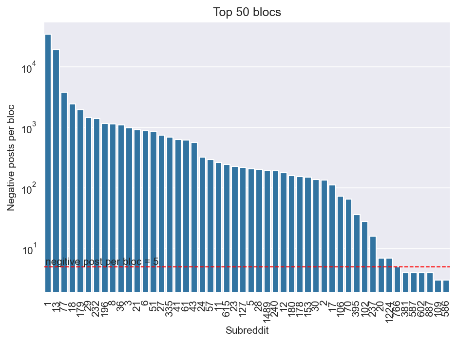
We notice that only 43 out of 2086 communities have more than 5 negative posts!
It is still a bit abstract, though. To better understand how these communities relate to each other, we now visualize the community network:
It’s much more visual! But how do we understand this network graph?
Each node represents a community identified by Louvain:
- the color represents its negativity rate : \(\text{negative_rate}(C)=\frac{\text{neg_out}(C)}{\text{total_out}(C)} \quad \text{(defined only when } \text{total_out}(C)>0\text{)}\).
- each edge represents a negative link sent from one community to another
- the size of the node represents the number of subreddits in the community.
We observe two main things:
- A highly connected core: the largest communities are located there and concentrate most of the negativity : they exchange many negative links with each other and around them, many small communities attack these large communities. These large communities also target certain small communities.
- Many small communities on the periphery: they have few or no negative links and don’t participate in the negative interactions of the core.
These large communities seem to act as “hubs” that concentrate negativity. It supports our moderation strategy: Rather than moderating uniformly across Reddit, we should focus on a small subset of communities !
So now, let’s zoom into this core set of communities:
3. Mapping interactions between high-use communities
Now that we’ve identified the communities consisting of our ‘core’ interactions, let’s pay attention to these higher-level clusters (e.g., politics, hobbies, geography, lifestyle). In the context of our app, we likely will not have any special communities that map to subreddits. For example, we may not have a community that corresponds to r/nfl or r/nba, but it is very likely that we will have groups of users that create sports communities. So by creating and understanding the interactions between these active high-level clusters, we can understand structural causes of conflict that appear regardless of specific subreddit identities.
Mapping the subreddit landscape
To go further, we need a way to place subreddits relative to each other, not just connect them through edges. For this, we rely on subreddit embeddings provided in the Reddit User and Subreddit Embeddings dataset[2].
The idea behind these embeddings is simple: two subreddits are close if they share similar users. Subreddits that attract the same types of users end up with similar embeddings, even if they do not directly interact. This gives us a way to build a “map” of the subreddit landscape, where proximity reflects shared user bases.
Each subreddit is represented by a 300-dimensional vector. To visualize this space, we need to reduce its dimensionality. We first apply PCA, keeping the 50 most informative components.
PCA? What's that?
Often times, real world data is incredibly complex. Rather than have simply one or two features, they can have thousands or even tens of thousands. But the issue with this, is that the more features data has, the harder it is for humans the filter through and understand this data. So, what's the solution? PCA! PCA, or Principal Component Analysis, is a way to take data that consists of many features, and condense it down into any number of features that you wish to. Of course, we may lose some information in the process. But this tradeoff is often times worth it since it means we no longer have to sift through thousands of features. Instead, we're typically left with only the most relevant ones. For the rest of this story, 'components', are the features that PCA extracts from our datasets.You might wonder: why 50 components?
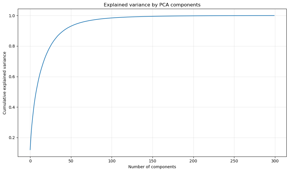
The figure above shows how much variance is explained as we add PCA components. We observe that the curve rises quickly at first and then starts to flatten. Around 50 components, more than 90% of the total variance is already captured. This means that most of the meaningful differences between subreddits are still preserved, while the remaining components mostly capture noise or small details.
We then apply t-SNE to project the data into two dimensions for visualization.
t-SNE?
t-SNE is another algorithm used to make complex data easier to visualize. It’s a bit more complicated than PCA, but the key idea is simple: t-SNE arranges data points in a way that keeps similar points close together. The result is a graph where natural groupings often appear clearly, making patterns easier for humans to see.Applying PCA before t-SNE turns out to be crucial. Without it, the visualization is noisy and there are no clear clusters taking shape. With PCA, the structure becomes much clearer and coherent clusters start to appear, which is important for the clustering step that follows.
In early versions of the map, we included all subreddits. However, this introduced a large amount of noise due to inactive or marginal communities. After building the G+ graph, we now understand that a small number of communities dominate interactions, while a long tail of subreddits contributes very little.
To focus on these “core” communities, we restrict the map to subreddits with at least 2,000 posts. This results in a much cleaner and more interpretable mapping.
Putting everything together, we arrive at the map below:
What is a VADER score?
VADER is a sentiment analysis tool which allows data scientists to attach sentimate scores to pieces of text. The scores generated by VADER range from -1 to 1 and can be interprated as follows:
- VADER > 0.05: Positive Sentiment
- VADER < -0.05: Negative Sentiment
- 0.05 > VADER > -0.05: Neutral Sentiment
It looks pretty neat! Take a moment to explore it and you’ll start seeing patterns emerge. Look at the “island” at the very top: “oaklandraiders”, “nygiants”, “anaheimducks”. See the common theme? Sports communities are clustered up there.
Now move your attention at the far left of the map. Another “island” appears, with subreddits like “ubuntu”, “windows10”, “python”. Looks like tech communities are gathering there.
This map will be our reference point going forward. We’ll use it to cluster subreddits, and then dig into how these clusters “talk” to each other.
Finding clusters in the map
Now that we have a map of the subreddit landscape, the next step is to group nearby subreddits into clusters. Here, a cluster simply refers to a group of subreddits that end up close to each other on the map and are expected to share similar themes or user behavior.
To do this, we use the K-Means clustering algorithm. The main question is how many clusters we should look for. To guide this choice, we rely on the elbow method: we vary the number of clusters k and observe how cluster tightness improves. Beyond a certain point, adding more clusters only yields marginal gains.
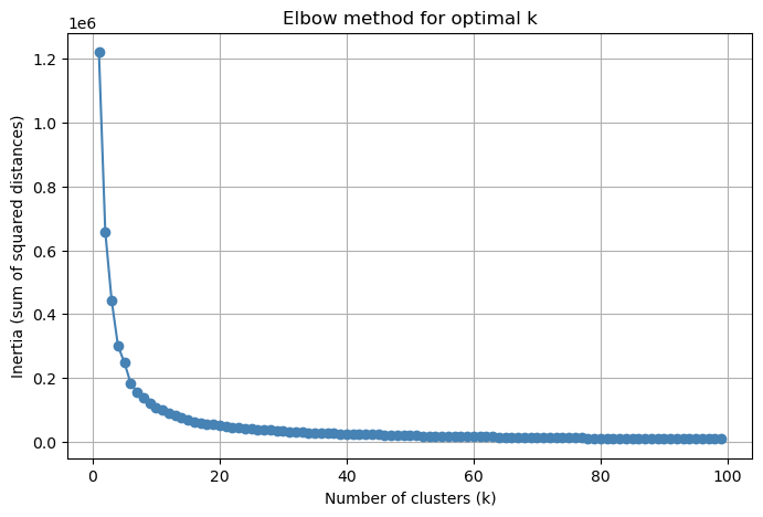
We pick this elbow point, which in our case corresponds to k = 20.
Important note: clustering is applied directly on the reduced representation used for visualization (PCA followed by t-SNE), rather than on the original 300-dimensional embeddings. We experimented with several options, including clustering on the original embeddings and on PCA-reduced embeddings only. In practice, clustering on the PCA + t-SNE space produced the most coherent and interpretable results, with clusters that are compact and thematically consistent.
The result is encouraging! Many of the visual “islands” we noticed earlier naturally turn into clusters. Sports communities that were grouped together at the top of the map end up in the same cluster, as do the tech subreddits on the left side. Other clear themes also emerge, such as gaming, politics, memes, or self-improvement.
Exploring the map you might notice that we assigned a name/theme to each cluster. This is done through a combination of manual inspection and LLM-assisted labeling
If you're curious, this table summarizes the resulting clusters
| Cluster ID | Cluster Name | Description |
|---|---|---|
| 0 | Mainstream Team Sports | Professional and college sports communities (NFL, NBA, NHL, MLB) plus fantasy leagues and team-specific fanbases. |
| 1 | Reddit Meta and Drama | Subreddits focused on Reddit culture, drama, archives, circlejerks, and meta-discussion about users and moderators. |
| 2 | Personal Advice and Mental Health | Communities offering personal help, relationship advice, self-improvement, and mental-health support, with some fitness and MBTI groups. |
| 3 | Core Gaming (PC/Console) | Major gaming franchises, PC/console hardware, and general gaming discussion communities. |
| 4 | News, Politics, and World Regions | National/city subs, world news, geopolitics, and science/technology communities discussing real-world events. |
| 5 | Tabletop and Strategy Gaming | Tabletop RPGs, board games, strategy/simulation titles, and story-driven gaming fandoms. |
| 6 | Politics, Ideologies, and Conspiracies | Highly political and ideological subs, ranging from mainstream politics to fringe ideologies and conspiracy groups. |
| 7 | Skepticism and “Bad X” Critiques | Subreddits dedicated to debunking low-quality content and discussing activism, moderation, and meta-critique. |
| 8 | Cryptocurrency and Speculation | Cryptocurrency communities, tipping ecosystems, and speculative finance/trading groups. |
| 9 | Music Fandom and Production | Music genre/band fandoms and music-making communities, plus some Reddit client/tool subs. |
| 10 | Esports and Anime Fandom | Competitive online gaming, esports scenes, in-game trading, and anime/manga-related communities. |
| 11 | Meta-Politics and Watchdog Communities | Ideology-focused watchdog, anti-extremist, and meta-political critique subs. |
| 12 | Cities, Careers, and Everyday Life | Local city communities, professional/academic subs, and everyday-life interests like pets, cooking, and travel. |
| 13 | Multiplayer Factions and Trading | In-game factions, clans, server communities, and trading hubs for multiplayer online games. |
| 14 | Technology and Programming | Programming languages, sysadmin/IT, operating systems, and mainstream consumer electronics. |
| 15 | Memes and Entertainment | Meme culture, humour subs, and TV/movie fandom communities. |
| 16 | NSFW and Adult Communities | Adult content, personals, kink/fetish subs, and related NSFW relationship-oriented communities. |
| 17 | Niche Gaming and Utility Subs | Smaller gaming leagues and assorted meta/utility subs such as feedback or trending lists. |
| 18 | Fashion, Beauty, and Lifestyle Hacks | Streetwear, beauty/skincare exchanges, vaping communities, and lifestyle/self-control groups. |
| 19 | Identity, Religion, and Social Issues | Identity-focused, religious, national communities, and anti-hate/social-issue watchdog subs. |
From this point on, we shift our analysis from individual subreddits to cluster-level behavior, where broader trends are easier to identify than when working with thousands of individual subreddits.
How clusters talk to each other
Looking at our map of subreddit clusters, an idea popped into our mind: is there a way to visualize how these clusters “talk” to each other?
To make this possible, we first reconstruct the text of Reddit posts. The original dataset does not store raw text directly, but it provides tokenized versions of post titles and bodies. Using the accompanying vocabulary, we can rebuild an approximate version of each post’s original wording.
Once we have text back, we can select a typical message for each direction of interaction.
Here’s the idea:
- Each cross-community interaction comes with a compact linguistic fingerprint: sentiment, emotion, style, and theme (the so-called
PROPERTIESvector). - For every pair of clusters (and for each direction), we look at all the posts exchanged between them.
- We then pick the post whose linguistic profile is the closest to the average of that group.
In other words, the message you see when hovering over an edge of the below plot is not the loudest or the most extreme, it’s the one that represents how these two communities usually talk to each other, based on their linguistic features.
This is what allows the graph to reveal asymmetries: the tone from cluster A to B can be very different from the tone in the opposite direction, even when the same communities are involved.
Take a moment to explore the graph below. Hover over the edges to read the typical messages exchanged between clusters. Some posts are friendly, others… less so.
Two details matter when reading this graph:
- Direction: a link \(A \to B\) means the post originated in cluster \(A\) and was targeted to \(B\).
- Averages can hide asymmetry: edge width is the total volume across both directions, and edge color is a volume-weighted average sentiment. A thick edge can still be mostly one-way, and a “neutral-looking” edge can mix a hostile direction with a friendly one.
This is not just theory: the largest bridge in the graph (Memes ↔ Personal Advice) is mixed—\(\text{Memes} \to \text{Advice}\) skews negative, while \(\text{Advice} \to \text{Memes}\) is strongly positive. The practical takeaway is that moderation can be directional: add friction only on the hostile direction instead of “blocking” an entire pair of communities and losing the beneficial cross-community flow.
A second pattern is that the harshest edges are often one-way. In the backbone shown here, some of the reddest, highest-volume corridors don’t have a meaningful arrow back (e.g., Skepticism/Bad‑X Critiques → Memes, Politics/Ideologies → News, Reddit Meta/Drama → Personal Advice). Structurally, that’s less like “two sides arguing” and more like targeting: one cluster repeatedly exporting negativity into another. For moderation, this is actionable: protect likely targets (rate limits, stricter review of inbound posts) while still allowing healthier, pro-social bridges (e.g., Cities/Careers → Personal Advice) to keep working.
From this, we identify the top five conflict-heavy cluster pairs the types of communities that most often clash:
-
(Personal advice ⟺ Politics, Ideology, and Conspiracies)
-
(Core Gaming ⟺ Technology and Programming)
-
(Personal advice ⟺ Reddit Meta and Drama)
-
(News, Politics, and World Regions ⟺ Politics, Ideology, and Conspiracies)
-
(Memes and Entertainment ⟺ Skepticism and Bad-X Critiques)
We notice that conflict isn’t evenly “smeared” across the platform: it tends to travel along a handful of high-traffic bridges. In our k-means cluster interaction graph, Personal Advice and Mental Health and Memes and Entertainment act as major connectors between otherwise separate regions of Reddit (high betweenness), which makes them disproportionately important for the spread of negativity even when they are not the original source. Meanwhile, the most toxic edges are extremely concentrated (e.g., Skepticism/Bad‑X Critiques → Memes and Politics/Ideologies → News), suggesting a practical moderation strategy for a startup: don’t try to “fix the whole network”monitor a small set of bridge communities and the top hostile cross-cluster links, and intervene early when those specific pathways spike.
Now that we have a way to identify which clusters are most likely to come into conflict, how can we act on it? One approach is to adapt our recommendation algorithm. In particular, we can reduce the visibility of posts from clusters that a user’s home cluster tends to react negatively to, ensuring that users are less frequently exposed to communities with which they historically clash.
In effect, this serves to limit cross-cluster exposure for pairs that produce consistently toxic interactions. There is one signficiant downside to this however - the creation of echo chambers. It’s known that when users are surrounded by those who share their own views, this creates ‘echo chambers’, or communities where extreme views tend to be amplified without being tempered by conflicting opinions. This concern leads us to our next section.
4. Thematic Features: Is All Negativity the Same?
We know that constructive disagreement is healthy. It avoids the creation of these so called echo chambers. On the other hand, toxic arguments are not healthy.
Research[1] suggests that even mildly negative hyperlinks can produce mini-echo chambers in the comment section. So unless we encourage the right type of cross community interactions, there’s a strong chance we’re only reinforcing the creation of these mini-echo chambers.
Lucky for us, negativity is not monolithic. We have several different types of negative comments such as:
-
Sarcastic but constructive
-
Critical but thoughtful
-
Outright hostile
-
Coordinated attacks
Using linguistic profiling (sentiment models, LIWC-style categories), we can look at the average textual features in each cluster’s negative posts. Our aim is to identify which clusters express negativety as critical, constructive arguments, and which clusters express it as hostility and personal attacks.
Global linguistic shift (negative vs non-negative)
Cluster-level drill-down
Pick a cluster to inspect its interaction network, profile, and radar view. The three panels below switch automatically when you change the cluster number.
Sentiment analysis takeaways
Looking across the cluster profiles, two dimensions consistently separate “healthy” disagreement from toxic conflict:
- Emotional intensity (anger, anxiety, sadness) tends to spike in ideologically charged clusters, but intensity alone is not the problem.
- Stylistic markers of hostility (swearing, shouting/caps, personal attacks) are the more reliable signal of harmful negativity.
This distinction matters. For instance, clusters like Personal Advice and Mental Health (Cluster 2) show elevated sadness/anxiety but low hostility markers, which suggests vulnerable but constructive exchanges. In contrast, Reddit Meta and Drama (Cluster 1) and Skepticism and “Bad X” Critiques (Cluster 7) combine high anger with high hostility cues, which is the pattern most correlated with cross-community escalations.
We also see that some large, high-traffic clusters (e.g., Memes and Entertainment (Cluster 15)) sit in a “loud but not hostile” zone: high energy, lots of slang, but comparatively low personal-attack markers. These are noisy but not necessarily dangerous.
Operational implication: sentiment alone is too blunt. Moderation should weight stylistic hostility more heavily than raw negative emotion, and prioritize interventions where both intensity and hostility spike together.
What does this tell us in terms of our new app?
When adjusting our algorithm we want to ensure that users active in clusters such as 12 and 2 tend to see other communities more often since they are more likely to exhibit negativity in a healthier way.
On the other hand, users from Clusters 7 and 1 are more likely to create comments that are angrier and more hostile. So like we mentioned in the previous section, it would be useful to prevent users from these communities from being shown posts from clusters they are likely to interact negatively with.
Protecting vulnerable voices in moderation
The distinction between emotional distress (anxiety, sadness) and hostility has critical implications for moderation policy. Communities like Personal Advice and Mental Health (Cluster 2) serve essential functions: they provide support, validation, and safe spaces for people experiencing mental health challenges, relationship difficulties, or personal struggles.
If our moderation systems rely solely on negative sentiment scores, we risk silencing these vulnerable voices. A post expressing sadness about a breakup, anxiety about a job interview, or depression about life circumstances might trigger automated filters designed to catch toxicity. This would be a catastrophic failure: we’d be removing the very content that makes our platform valuable for people seeking help and connection.
Emotion analysis: distinguishing sadness/anxiety from toxicity
The following visualizations demonstrate how sadness/anxiety (emotional distress) and toxicity (hostility) are distributed differently across clusters. This data supports our moderation approach of protecting vulnerable voices while still catching harmful content.
Sadness/Anxiety Distribution:
Toxicity Distribution:
Cluster Emotional Profiles:
Notice how clusters like Personal Advice and Mental Health (Cluster 2) show high sadness/anxiety but low toxicity, while clusters like Reddit Meta and Drama (Cluster 1) show the opposite pattern. This separation validates our multi-factor moderation approach.
Moderation safeguards:
-
Multi-factor detection: Never rely on sentiment alone. Combine emotional intensity with hostility markers. Only flag content when both negative emotions and hostile language (swearing, personal attacks, threats) are present.
-
Community context: Recognize that clusters with elevated anxiety/sadness but low hostility are often support communities. Apply more lenient thresholds for these spaces, or create explicit “safe space” designations that protect vulnerable discussions.
-
Human review for edge cases: When automated systems detect high emotional intensity without clear hostility markers, route to human moderators rather than auto-removal. This protects false positives while still catching genuine toxicity.
-
Transparency and appeals: Users whose content is removed should understand why. If someone’s vulnerable post about mental health is mistakenly flagged, they need a clear path to appeal and understand that expressing difficult emotions is not a violation.
The goal is not to eliminate negative emotions from the platform—that would be both impossible and harmful. Instead, we must distinguish between people expressing pain (who need support) and people causing harm (who need moderation). Getting this wrong doesn’t just hurt our metrics; it hurts real people who came to our platform seeking connection during difficult times.
5. The Solution: The Moderation Matrix
We have identified who fights (the clusters) and how they fight (the linguistic profile). Now, the final question for our startup is: How do we fix it without going bankrupt?
Hiring human moderators is expensive, while AI moderation is cheap but struggles with nuance. To solve this, we developed the Moderation Matrix to prioritize resources based on two factors: Scale (Interaction Volume) and Risk (Toxicity Ratio).
How the Moderation Matrix is computed
Each community is a point in a 2D space:
- Scale measures how much a community participates in cross-community interactions.
- Risk measures how negative those interactions are.
We use the same community-level aggregates defined earlier:
\(\text{Scale}(C)=\text{total_out}(C) \quad \text{where } \text{total_out}(C)=\text{pos_out}(C)+\text{neg_out}(C)\) \(\text{Risk}(C)=\frac{\text{neg_out}(C)}{\text{total_out}(C)} \quad \text{(defined only when } \text{total_out}(C)>0\text{)}\)
The x-axis uses a log scale for volume, while the y-axis shows the raw risk ratio.
Graph 9 confirms that toxicity follows a strict Pareto Principle (80/20 rule). A tiny fraction of communities creates the vast majority of our problems. By plotting our 20 communities on a log-scaled volume axis against risk, distinct strategies emerge for different quadrants:
- The “Kill Zone” (Top Right)
- Characteristics: High Volume, High Toxicity.
- Example: Politics, Ideologies, and Conspiracies (Cluster 6). This cluster is massive and consistently hostile.
- Strategy: Manual Moderation Required. This is where we burn our budget. These communities are too large to ignore and too nuanced for AI to catch every dog-whistle. Human intervention is mandatory here to prevent site-wide contamination.
- Niche Hate (Top Left)
- Characteristics: Low Volume, High Toxicity.
- Example: Meta-Politics and Watchdog Communities (Cluster 11).
- Strategy: Automated Flagging. These are small, isolated pockets of negativity. Because they don’t drive massive traffic, we can aggressively use strict AI keyword filters. If we accidentally ban a false positive here, the impact on the platform’s overall growth is minimal compared to the “Kill Zone”.
- Healthy Viral (Bottom Right)
- Characteristics: Massive Volume, Low Toxicity.
- Example: Memes and Entertainment (Cluster 15).
- Strategy: Self-Regulation. These communities are the “Golden Geese”. They are huge and active but remain civil. We should do nothing here; heavy-handed moderation would only stifle their growth. Let the community downvote buttons do the work.
The Startup Takeaway: Don’t try to moderate the whole internet. Ignore the bottom-right, automate the top-left, and send your human team into the top-right Kill Zone.
One thing the Moderation Matrix doesn’t show is how conflict spreads. A cluster can look fairly “safe” on average, but still be a busy crossroads where many different communities meet. If a toxic cluster can reach the rest of the platform through these crossroads, negativity travels farther and faster.
So in practice, we won’t just moderate the “worst” clusters. We’ll Also watch the bridge clusters and the few specific cross-cluster links that carry most of the hostile traffic. Adding small frictions on those pathways (rate limits, stricter review, reduced amplification) can slow down spillover without heavy-handed moderation everywhere.
6. Timing is Everything: The “Viral Outrage”
Finally, we must understand when to deploy these resources. Is toxicity a constant background hum, or does it strike like lightning?
We analyzed the volume of interactions over time, stacking positive exchanges against toxic conflict.
The data refutes the idea that “internet trolls are always on”. Conflict is not a flat line; it is bursty and follows a pattern of Volatility Clustering.
- The Baseline: For most of the timeline (green area), the platform is overwhelmingly positive.
- The Spikes: Look at the “Peak Volatility” on the far right. We see sudden, sharp expansions in the red area (toxic conflict).
What causes these bursts? These spikes usually correlate with external real-world events (elections, scandals, viral news). When these events hit, the “Kill Zone” communities identified above flare up simultaneously.
The Operational Lesson: We don’t need a massive standing army of moderators 24/7. Instead, we need Surge Capacity. Our system needs to detect the initial slope of a “red spike” (as seen in late 2017) and dynamically scale server costs only when the alarm sounds.
Concretely, the easiest “early warning system” isn’t watching the whole platform it’s watching the handful of cross-cluster edges that historically carry the most conflict. When those specific links start ramping up (for example, the strongest Politics→News or Skepticism→Memes pathways), that’s a reliable signal that a broader spike is about to propagate through the network.
7. The Algorithm: From Reaction to Prediction
Descriptive graphs are useful, but to build a scalable platform, we need predictive metrics. We don’t just want to watch the house burn; we want to catch the spark.
To do this, we treat toxicity not as “bad behavior,” but as a virus.
The “Toxicity $R_0$” (Viral Coefficient)
In epidemiology, $R_0$ represents the reproduction number of a virus how many people one infected person will infect. We applied this same logic to our community clusters.
We define the Viral Toxicity Coefficient ($R_0$) as:
\[R_0 = \frac{\text{Rate of new toxic replies}}{\text{Rate of moderation and deletion}}\](Note: The formula logic is inverted from standard removal rates to reflect viral growth potential, or strictly as defined in your heuristic)
This formula gives us a binary decision matrix for our automated systems:
- If $R_0 < 1$ (Decay): The conflict is dying out naturally. Even if the volume is high (like in Memes and Entertainment (Cluster 15)), intervention is unnecessary. The community’s immune system is working.
- If $R_0 > 1$ (Growth): The toxicity is self-sustaining and expanding. This triggers an immediate alert to the “Kill Zone” moderators.
Mapping the Contagion Vectors
Finally, we asked: How does the infection escape the Kill Zone?
If the toxic Politics, Ideologies, and Conspiracies (Cluster 6) was isolated, we could simply ban it. However, our network analysis reveals a more dangerous structure: Bridge Communities.
We found that mid-sized clusters specifically Reddit Meta and Drama (Cluster 1) often act as “Vectors”. They do not originate the hate, but they import memes and language from the Kill Zone and sanitize them for the mainstream.
The Strategy: To stop the spread, we don’t just police the source (Red nodes) or protect the victims (Green nodes). We do it by strictly moderating posts passing through “Vector” communities, we break the chain of transmission ($R_0$) before it reaches the healthy viral clusters.
8. Some good news: metrics over time
In our previous analysis, we determined that the toxicity on Reddit is mainly driven by a few communities. This is good news as moderating a few toxic communities is much easier than moderating the whole website.
Let’s take another angle, that of the evolution over time of the toxic interactions: is it getting better or worse?
Answering this question would allow us to understand whether we need to take more drastic steps to address the possible spread of toxicity in our app.
Since we now are a veteran of ADA’s methodology, let’s first take a look at how the network evolves over time before making any hasty conclusions!
Below are 4 time graphs with statistics over a moving window of 1 month, made by our very smart colleague. Sadly, he forgot to annotate these “trivial” graphs. Let’s not panic and put on our detective hat to understand these:
On the top left and top right graphs, we can see that the number of edges & nodes increases almost linearly, which is slightly surprising since reddit had an explosive growth in that timeframe, but it’s a particularity of the way reddit has communities.
Indeed, while the number of users grew exponentially over that timeframe from 85M in 2014 to over 250M in 2017, one can explain this linear growth by simple graph theory: preferential attachment, a fancy word for “the rich get richer”. In our case here, new users join existing communities instead of creating new ones, meaning that those communities grow larger. But we’ll get back to that last part.
Now let’s try to understand the ones at the bottom, starting with
- The bottom left: the degree of a window over time. The degree is the number of connections(edges) each node has to other nodes. The higher, the more connected the graph is. We can see that over time this number fluctuates quite a bit, but on average it increases over the timeframe: Reddit becomes more interconnected, more dialog! This is good news, we want to emulate the same behavior in our social media.
- The bottom right: You remember you’re a detective that took the internet analytics class and vaguely remember that the modularity, in a nutshell (see below for complete explanation) is the expected number of edges between two nodes. This is a measure of how much the graph is “community-ified”. A score of 0.6+ is a high score for such a graph, meaning that Reddit is quite well partitioned in communities. This is good as Reddit managed to group similar people together, but the flipside is that Reddit also could potentially lead to “echo chambers”. This is something we need to watch out for in our new social media.
What is modularity?
Modularity measures how strongly a network is divided into communities. It compares the actual number of edges inside communities to what we would expect if they were distributed randomly .
Formally, modularity is defined as:
\[Q = \frac{1}{2m} \sum_{i,j} \left( A_{ij} - \frac{k_i k_j}{2m} \right) \mathbf{1}(c_i = c_j)\]Where:
- $A_{ij}$ is the observed edge weight between nodes $i$ and $j$
- $k_i$ and $k_j$ are the (weighted) degrees of nodes $i$ and $j$
- $m$ is the total edge weight in the graph
- $c_i$ is the community of node $i$
- $\mathbf{1}(c_i = c_j)$ is 1 if $i$ and $j$ are in the same community, 0 otherwise
Intuition:
- The term $\frac{k_i k_j}{2m}$ is the expected connection strength if edges were placed at random.
- Modularity sums how much extra connectivity exists inside communities beyond that random baseline.
Interpretation:
- $Q \approx 0$ → no clear community structure (random-like graph)
- $Q \in [0.3, 0.6]$ → meaningful community structure
- $Q > 0.6$ → very strong community separation
In our case, modularity above 0.6 indicates that Reddit is well-partitioned into communities that interact much more internally than externally.
Now, let’s take a look at the proportion of positive posts vs negatives over time. Ah, our colleague made just the perfect graph! Let’s take a closer look:
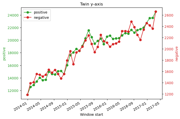
Well that’s not exactly good news… It seems that the number of positive interactions grows the same as the negatives. This means that the reddit way of moderating is keeping the status quo, not improving it.
BUT WAIT, let’s not be too hasty, indeed we are now a seasoned ADA enthusiast. Let’s make sure we understand the graph before concluding that Reddit moderation is bad, even if it seems likely.
Hmmmm, the timescale looks the same as the other graph, the labels make sense, but there aha! The scales are different! Our sneaky colleague put both numbers on 2 different axies, and indeed the proportional growth of the positive and negative interactions is about the same.
But, let’s plot them on the same scale:
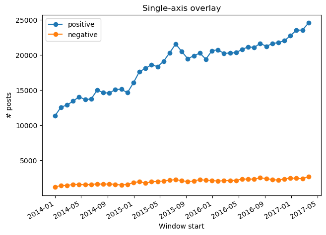
Aha! The negative interactions pale in comparison to the positive ones, so actually this is excellent news! This means that taking a similar moderating approach to Reddit works on a large scale!
Let’s now make a graph of our own to find out the few negative interactions are coming from. We want to find out if it’s general negativity or if it’s particular communities:
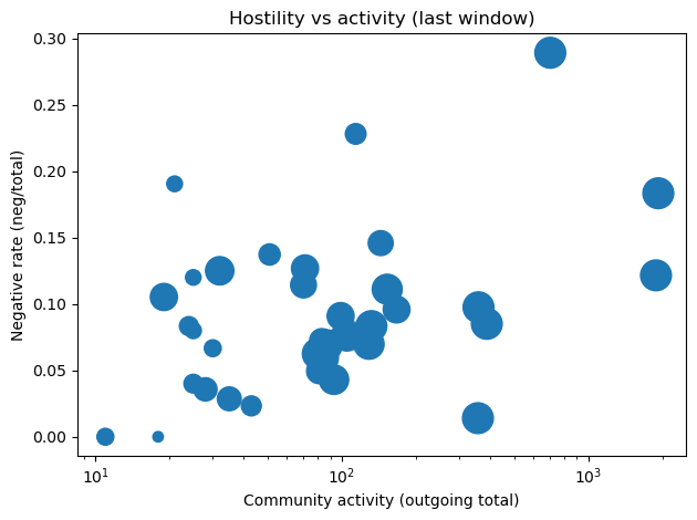
We can see that most communities are in the lower half, and that there are a few clusters in the upper parts of the graph. This is excellent news, as this means that we can focus our moderating efforts on those “toxicity prone” communities and thus curb the general toxicity on our new platform!
9. Final Lessons
Our analysis demonstrates that effective moderation is less about eliminating all negativity than about understanding how it emerges and where it concentrates. The community structure shows that harmful behavior is not evenly distributed, making targeted, community-level interventions more effective than uniform enforcement. These insights suggest that scalable moderation should combine network analysis, localized policies, and graduated enforcement mechanisms. Platforms that align moderation strategies with their underlying social dynamics can reduce toxicity without undermining open discussion.
References
[1] Kumar, S., Hamilton, W. L., Leskovec, J., & Jurafsky, D. (2018). Community interaction and conflict on the web. In Proceedings of the 2018 World Wide Web Conference on World Wide Web (pp. 933–943). International World Wide Web Conferences Steering Committee.
[2] Kumar, S., Zhang, X., & Leskovec, J. (2019). Predicting dynamic embedding trajectory in temporal interaction networks. In Proceedings of the 25th ACM SIGKDD International Conference on Knowledge Discovery & Data Mining (pp. 1269–1278). ACM.